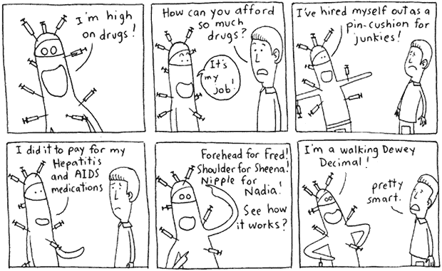
Entitled New Low, this comic can be viewed on the white ninja comic website. Although it is somewhat different from the typical Sunday-paper comic, this series of panels uses many of the rhetorical concepts and techniques as defined in chapter 15 of CDA, as well as in Scott McCloud's book The Vocabulary of Comics. The general theme within this particular comic appears to be people who do things for others without even thinking about the implications of these actions. Specifically, it uses drugs and "druggies" as an extension for this message. It also briefly mentions how this type of lifestyle is one of a circular path, with one bad thing leading to another.
The first and most basic device used within the panels is the simplicity with which the characters are drawn. As McCloud mentions within his Vocabulary of Comics, the primary reason that people connect with the various symbols and messages within comics is that they are simple enough so that people can relate with them, or apply them to their own life. If there were too many details to make the pictures seem more realistic, then people would not be able to associate themselves as closely with certain figures. In fact, while the guy on the right is simply a stick figure with definition, the guy on the left hardly resembles anyone. Thus, from the reader's experience, he/she can mentally relate a person they know with one of these characters. In addition, the more relaxed atmosphere allows the author to approach the serious subject of drugs to a wider range of audience. As I am planning on writing/drawing my own comic for this assignment, I hope to employ this simplistic effect in my work as well. Instead of using lots of detail to make the message applicable to a specific audience, I plan to expand this audience by being less specific/detailed. In addition, the use of simple symbols in my comic, such as the syringes in this one, allow for further connection.
Another device that is used within the comic strip is the implementation of a specific typeface: script. As defined in CDA's chapter 9, "typography is the study of how lettershapes-on paper or on screen-work functionally and rhetorically." In using a script letter-type, or one that looks as though it is handwritten, the author gives the viewer some information regarding the types of characters in the story. In this instance, the letters look like they were written somewhat sloppily, and thus communicate a certain unprofessional or relaxed atmosphere to the reader. Coupled with the theme of drugs within the comic, as well as the body form of the character on the left, this style of communication relates to the message being portrayed. As I am thinking about doing a comic that discusses a more serious subject such as trash, recycling, and the environment, I will have to think about using a more "creditable" typeface, such as sans serif.
No comments:
Post a Comment