Sunday, April 18, 2010

WP3: Fourth Post

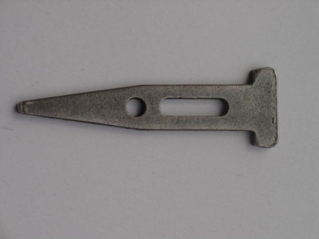
As is obvious when looking at the sculpture located between Architecture Hall and the Westbrook Music Building, the name Variable Wedge suits the form of the object. A device that tapers from one edge to the other, a wedge can be used to hold objects in place, split an object apart, or lift an object up. Thus, there are many different contexts that the variable wedge could be placed in. The wedge is one of the earliest tools developed by man, and so in creating this particular model of the tool, Sam Richardson might be trying to tell us something about our primitive beings in respect to the modern, man-made world (as evidenced by the geometric shape).

Although the sculpture itself may at first appear to be this long wedge split into seven sections, acting like a door-stop in time, the name might also be referring to each individual section in its own right. In addition, if one looks even closer, the name could also be referring to the negative space that exists in-between the various sections, as these are angular wedges as well.

In looking at the history of the wedge, the time when it was first used or incorporated into society is largely unknown. Archeologists have uncovered evidence, however, that points to the Egyptians using bronze wedges to sculpt and break away stone when they constructed. In this way, used as a device during the construction and manipulation of materials, it is fitting that Richardson chose to orient this steel piece in between Architecture Hall and the Westbrook Music Building. Of course it is somewhat obvious that a wedge could directly be associated with the function of architects in society, as they design and manipulate materials as well in order to create the structures in which we live. Musicians too, however, manipulate waves of sound so that they resound in us, bringing forth various feelings in our soul.

Wednesday, April 14, 2010

WP3: Third Post

Upon further reflection of Variable Wedge by Sam Richardson, there are other aspects of the sculpture that are necessary to look at when analyzing its rhetorical value. Building upon the materials used, as briefly mentioned in the previous post, the sculpture is not only made out of Cor-Ten Steel, but this steel is then situated on top of a cement foundation beneath it. In this way, not only does the steel have a strong and sturdy structure, but the concrete only further solidifies this form. This rigid, geometric figure produces a stable reaction to the viewer, as if the form is where it is supposedItalic to be, and not moving from that state. Despite this, there is a definite narrative in the progression of the wedge, which sort of juxtaposes this stationary feeling, and provides some movement for the sculpture.
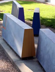
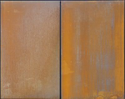
As far as the other chemical and visual properties of these two materials, Cor-Ten steel is meant to weather from its original state, while concrete remains relatively the same except for cracking due to shifts in the ground. With the steel, a chemical, corrosive process produces a protective layer of rust on the outside when exposed to outdoor elements over time. This is particularly interesting, as this changes the color of the sculpture, with the exception of the sides painted with the bright hues. Visually, it is somewhat obvious that the appearance of Variable Wedge will change over time due to this chemical change, especially its color. In addition, however, its form will shift slightly as well. When the Wedge was first created and assembled in its current location, one can assume that great care was taken to situate it in a manner parallel to Westbrook Music Building, but also to place each section of the wedge in-line with the other sections. Although this linear progression is still a major effect conveyed to the viewer, when one views the sculpture from the West, it is obvious that the first four sections have shifted slightly. In this manner, there are slight discrepancies between these sections, which I would imagine Richardson would have thought about when he created Wedge. Rhetorically, this can be conveyed through a logos lens as pertaining to the variance experienced in one's life: areas of tension, etc.
Lastly, when talking about the positioning of the entire piece, especially when viewed from the West looking East, one notices how the form of the sculpture points out into space. The tops of each of the sections extend upwards, so that since the piece is located on a hill, it gives the viewer a feeling that they are being shot up into the sky. When applied to this theme of life that the sculpture insinuates, this gesture is quite fitting, as it implies setting high goals for ones self. "If you shoot for the moon, you will land among the stars."

Thursday, April 8, 2010

WP3: Second Post


In looking at the sculpture Variable Wedge by Sam Richardson, there are many rhetorical techniques, strategies, and concepts utilized to make certain appeals to its audience. When one first observes the sculpture, the first thing that the eye notices is the form of the "wedge," and how the title plays into this form. The sculpture consists of seven separate sections of a wedge, or triangular-shaped form as viewed from the side, which has the cross section of a regular trapezoid. When viewed from the side (North or South views), it appears as a complete wedge. When looked at from any other view, however, one notices that the fifth and sixth sections within this wedge sort of branch out from the linear pattern established within the first four sections. The fifth is rotated so that it is branches out toward the North, while the sixth one branches out toward the South. Finally, then, the seventh section is oriented in-line with the first four sections, as it is back on track. This form, whose title makes sense with the orientation of the piece, begins to possibly establish a narrative for the entire sculpture, one of progression from small to large through time: possibly even growth. The trapezoidal cross-section, however, as well as the geometric shape appeal to logos, as it is a stable form, with a large base.

The second element about the sculpture that is hard to miss are the elements of color located on the sides of the slices: as if someone had taken a saw colored with paint and cut the big wedge up into smaller pieces. These hues make an appeal to pathos, as they are vibrant colors: relatively bright with a lot of saturation. These possibly refer to the core or inner values within people, which can especially be seen when people stray off of the normal path. Due to their vibrant nature, these colors emit a sense of energy to them, especially since they are juxtaposed with the cool gray that engulfs the outside surface of the sculpture. The material also becomes important, as the piece of art is composed of Cor-Ten Steel, which is smooth, but geometric looking. The fact that the sculpture is located outside adds to this effect, as the gray surfaces are noticeably weathered, with rust forming on them. These colored sections are not, however, which makes them all the more vibrant in comparison.

The last element that is extremely noteworthy, especially considering Sam Richardson's background with landscaping elements, is the environment in which the sculpture is located. Situated in a position parallel and in between the Westbrook Music Building and Architecture Hall, the sculpture seems to discuss the subjects of these two buildings. The form of the wedge seems to depict a progression through life, addressing how professionals such as musicians and architects sometimes need to branch off from the main road in order to show their talents, or colors.

Wednesday, April 7, 2010

WP3: First Post

In the past, I have had some experiences with art objects, and am familiar with a few of the processes used to make art. Ever since I was a youngster, I have had an unconscious fascination with art, and have always enjoyed creating things. Thus, all the way up through middle school, I thoroughly enjoyed the art classes I took. Furthermore, although my schedule in high school didn't allow me to take such courses, I continued to occasionally paint and draw on my on time. Currently, as an architecture student, I am required to take the visual literacy courses, such as drawing and painting classes, in which I have learned how to better create such art. In addition, classes such as Analysis and Composition have allowed me to better understand the form of certain pieces of art using tension, balance, hierarchy, etc.

Besides making some of my own pictures and paintings, I have also had experiences with pieces of art such as paintings, drawings, sculptures, and other instillations by visiting various art museums throughout my life. Besides annually venturing to the Joslyn Art Museum in Omaha, I have experienced art museums in Kansas City, St. Louis, Phoenix, Chicago, and even the Prado in Spain. Some of the works of art that I have found the most fascinating have been mobiles, such as one done by Calder at Joslyn, as well as other three-dimensional, kinetic sculptures. These works in particular have the ability to make you wonder how they work, or sometimes what they even represent. In looking at these various works of art, however, I have not spent more than a maximum of 15 minutes analyzing or looking at any single piece at a time; it is a typical look, think, and move on.

Another form of an art object that I enjoy is architecture. From Taliesin, which is Frank Lloyd Wright's home in Wisconsin, to the ancient castles in Seville, Spain, I am fascinated by the way in which buildings are designed. Furthermore, the way in which they fit into their respective environments is something that can inform the reader about the subject. In a similar manner, I believe that the way in which sculpture is situated and located among its surrounding elements contributes vastly to its meaning.

Tuesday, April 6, 2010

WP2: Final Comic

Author's Note

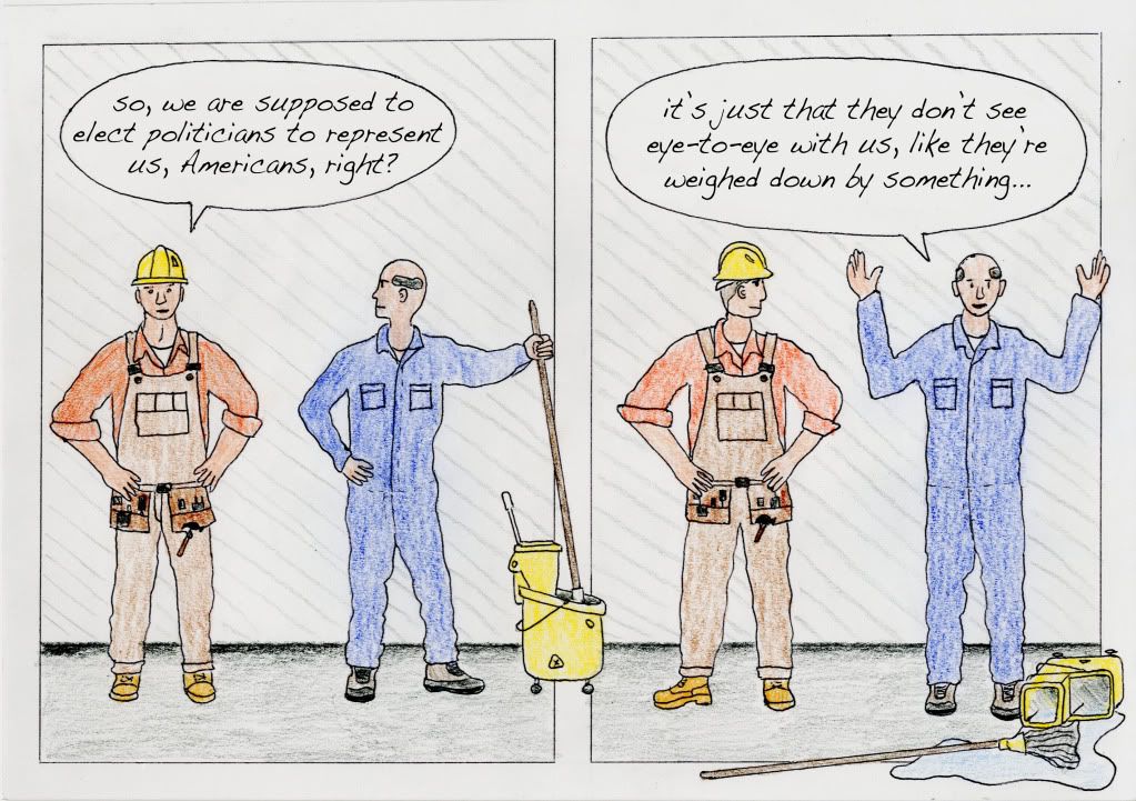
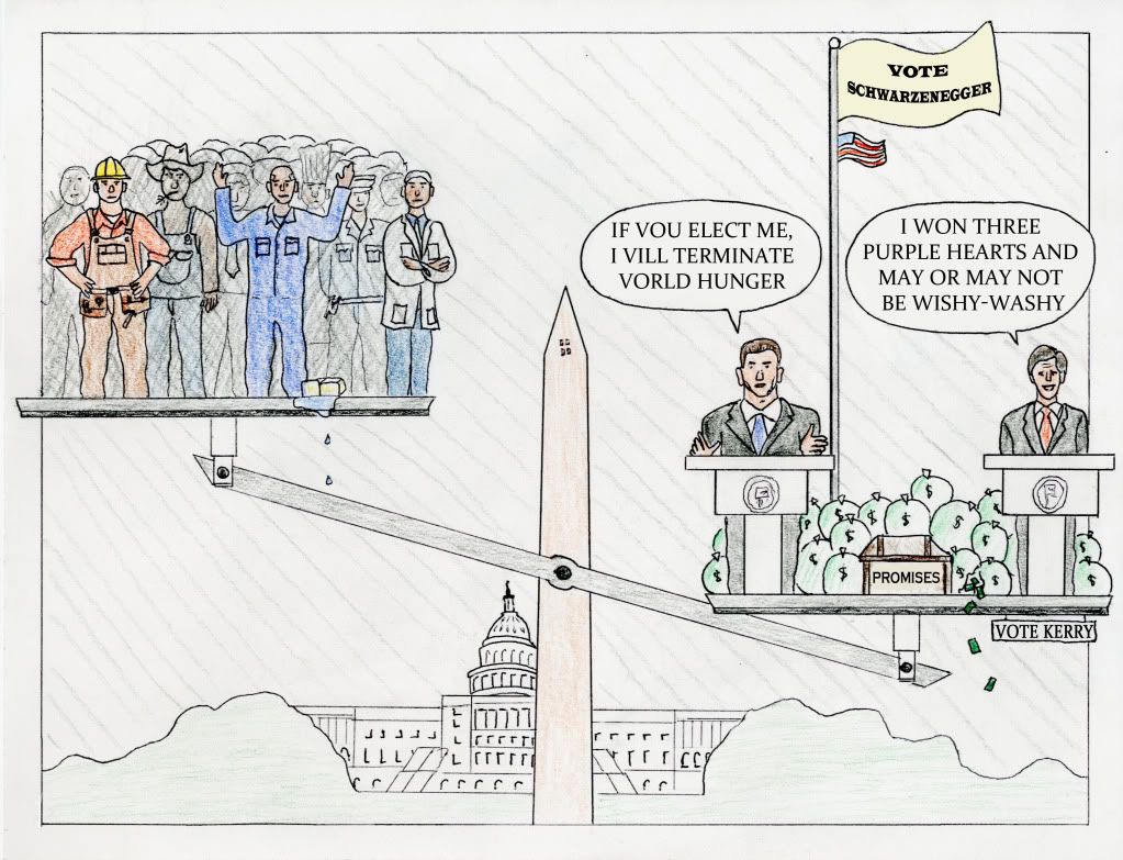
The central theme surrounding my comic, as mentioned in the statement of purpose, is that politicians live in a different world than the average American. As demonstrated through their financial status, fame and fortune, as well as political agendas, the lifestyle of a politician often juxtaposes that of the public, and prompts the questioning of their true representation of the people. Communicating this message to my audience via a comic was no easy task, and it involved an ongoing editing process, working with aesthetic and structural elements.

When I originally decided to focus on the differences between politicians and citizens, I foresaw the use of an amusement park with a “political entry booth” as an icon to emphasize the money needed to back a campaign. However, this did not depict some of the other points I wanted to make, and so I decided to use a balance to compare the two groups. Furthermore, in choosing specific iconic people to represent Americans and politicians, I was forced to make decisions regarding who to draw. As pertaining to the citizens, I chose to incorporate many recognizable “blue collar” jobs such as a construction worker, janitor, farmer, etc, while I selected several well-known political candidates for the politicians (from both parties).

In addition, I wanted to add some humor to the message, which is why I included the satirical phrases spoken by the politicians. Although made popular by shows such as SNL, these phrases address some of the same disparity between politicians and the public that I wanted to tackle. Lastly, I had to make aesthetic decisions regarding the typography of the comic. Initially, I hand-wrote the dialect, but eventually decided to use word-processed type for consistency and a professional look. In this way, I was also able to change the fonts between panels: using a lower-case, handwritten font for the everyday workers, versus an uppercase, “professional” font for the politicians.

Also key to this process were the use of rhetorical concepts with which to base aesthetic choices off of. One example of this is that it is especially important within a comic genre to establish a particular pathos and ethos with the audience so that they are able to personally identify with the message. Unlike essays and other such medium, icons in comics can be drawn with varying levels of abstraction. In this way, as stated by McCloud, there exists “amplification through simplification.” Thus, because I wanted the reader to be able to identify with the Americans in the composition, I abstracted these people so that their faces contained few details. In this way, the reader is still able to classify their occupations and what they represent, but also identify with them. The politicians, however, are abstracted much less, so that they are more objective and recognizable.

Another rhetorical concept that is important within the framework of a comic is using icons and symbols to represent various ideas. The main icon I chose to use was the scale, which essentially compares two different groups of people: U.S. citizens versus U.S. politicians. In this manner, I was able to depict using the symbols how the politicians are generally different from everyday citizens. In addition, I juxtaposed the symbolic falling dollar bills with the spilled mop water to further compare these two groups of people. On a larger scale, I chose to incorporate the Washington Monument and Capital building to address through logos what is affected by this conflict.

Lastly, in order to make the comic unique, I tried to break away from some of the norms associated with that medium. One such decision, which engages the audience, is to sever the frame of the various panels with the subject matter. By intersecting the frames with the mop bucket and scale, the audience’s attention is called to this subject matter, making them think about what the objects represent and how they fit into the comic. In addition, because the comic is published on a blog, I thought about how I could utilize that context to further break some of the other norms. Thus, creating an “alternate ending,” was a structural choice that allowed me to add another dimension to the comic.

Statement of Purpose